Feedback:User/Tekn0mancer/Template Manager tweaks
From Guild Wars Wiki
< Feedback:User | Tekn0mancer
Jump to navigationJump to search
| Template Manager tweaks | |
|---|---|
| User | Tekn0mancer |
| Categories | Mechanics → User interface |
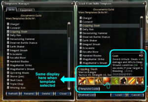
Clicking on a list-item in the Template Manager currently puts a highlight bar on the selected template, but does nothing else. Selected template display should be large and fixed, with concise description display on skill icon mouseover. This function already exists in the Load from Template panel and should be copied. In addition, the Template Code panel should be quickly and easily accessible from the management panel:
- Single-clicking on a list-item should work exactly the same as it does in the Load from Template panel (see screenshot).
- Double-clicking on a list-item should behave as if you clicked the Template Code button (obviously if the player doesn't have one or both of the professions required, the Load button should be greyed out).
- On Rename, the panel's text field should display the existing name (selected and highlighted), the same way the rename function operates in Windows.
- This is more of a buff than a tweak, but how about adding a "Load Templates" tab that's kind of a lightweight combination of the Skills & Attributes and Load Template panels. Put hero icons along the top, the selected hero's current skill bar (fixed display) along the bottom, with the "Load Template" list between them. The display at bottom changes only when the loaded skills do, template contents can be viewed via the mouseover popup, and double-clicking loads it to the currently selected hero (see mock-up).

