User:Magamdy/Render Diary
So I figured if I'm really gonna try and render all/as much as of the NPCs/objects/items in game, I might as well write a blog-thing about the weird stuff that I come across. Also it seems interesting to give some explanations on choices I make, how I render and stuff and how I break my head over trying to render impossible to render stuff (looking at you gemstones.)
Replacing Emily Diehl's renders[edit]
So recently, after purposefully abstaining myself from it, I decided to begin replacing Emily Diehl's renders. Yes, I, a mere mortal, have challenged the Render God itself. But it turns out even Xerxes Emily can bleed, as some of her renders show clear flaws. I think it shows that Emily is really in the same boat as all who tried rendering on this wiki before: you have the passion for the project but not the skills with 3D programs to accurately recreate those pesky models. This shows in her earlier renders. For example File:Sensali martial.jpg is missing the reflection texture. Her later renders include it properly. It took me a helluva lot of time to understand how the game applies this reflection, and it often still isn't perfect. I imagine for Emily it also wasn't as easy as flicking a switch.
- Let's get to the 'argument' for replacing renders. Open up File:Baron Mirek Vasburg.jpg and open Emily's initial render so you can switch back and forth. First thing that's a noticeable difference between hers and mine is the lightning: her's has added shadow, while mine uses 'abient lightning', i.e. no shadows whatsoever. It's a matter of preference really. Shadows can make the render look more natural, while absence of shadows reveal more details, and give the image a 'smooth' look in my opinion.
- One problem that almost all of Emily's renders have is that they seem to be compressed too much. When you look closely at the Barons smexy body you can see the image has a somewhat dirty and gritty look due to unnecessary compression, which my images are luckily free from when opened on it's own.
- Another 'cosmetic problem' Emily's renders are plagued with is the lack of anti aliasing. When rendering through 3DS Max the rendered image automatically receives a very high anti aliasing effect (in fact, sometimes it makes things so smooth it makes a render look different from it's ingame appearance). This is apparently a limitation in Emily's Arenanet model viewer program thing. In the case of many Kurizch models the effect is worse because the hair comes out very glitchy, having strokes of white through out, as if missing strands of hair. Zooming in on the hair in 3DS MAx shows it's drawn in a unusual zig-zag pattern, so maybe that causes it. Either way, my render fixed it.
- Last but not least is what I call the 'fisheye' effect. This happens when you, during rendering, zoom in on the model you are rendering in such a way that it creates an effect as if the model was a picture glued to a round 'fisheye': the center of the image appears bigger than it really is and the feet and head smaller. This makes it so that the Baron's feet appears as if you are looking down on him, and yet his head suggest you are looking directly at him. However this is an illusion too, as the model is made in such a way that he looks down a bit.
In 3DS Max this effect is caused by zooming in with the scroll wheel. My earlier renders suffered from this. The trick is to zoom in with the 'Field of View' button, allowing you to get a perfect, head-on view that is very hard to replicate in-game. Luckily Emily's last batch of renders fixed this problem: File:Charr elementalist.jpg.
So this is why I decided it would not be sparing Emily's renders anymore if I think I can simply improve them.
Easter Egg Textures?[edit]
07/03/2016
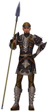
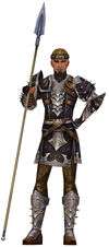
I just now rendered the 'spearman' Ebon Vanguard dude you see only in the final cinematic of the flight North.

 The left image is the model without the usual 'reflection texture' applied to the armor. The right one does have it. Looks quite a bit nicer.
However, there's one thing you probably don't notice: it's that the shine texture is actually Freaking THIS. Yeah. Is this a Anet picnic photo? I have no idea.
This really makes me respect the Arenanet artists that developed a system that allows you to slap literally anything on a model and make it look good. I wonder what more of this kinda stuff is hidden in the game.
Random renders[edit]
In this section I might as well place anything that is interesting to render, but cannot find a proper home somewhere else on the wiki.
